Project name
Aesthetic branding for stylist Minimalistlooks by Violetta Fainsil
Testimonial
„It’s always a pleasure to work with a professional — and that’s exactly what Agnė is: attentive to detail, undoubtedly possessing great taste and a strong sense of aesthetics.”
Violetta Fainšil is a stylist known for her minimalist yet refined approach, combining clean silhouettes with a subtle vintage sensibility. The goal was to create a brand that reflects this balance, blending Art Deco influences with a modern and timeless aesthetic while maintaining a unisex appeal. The project included the development of a cohesive identity system, including logo design, business cards, and gift vouchers, shaping a distinctive and consistent visual language.
Alongside the identity, I directed and executed a series of photoshoots that became an integral part of the brand. The imagery was designed to function as a core visual asset across touchpoints, from social media to editorial publications such as Lamų Slėnis. The result is a cohesive brand experience where art direction and identity work seamlessly together across print and digital formats.
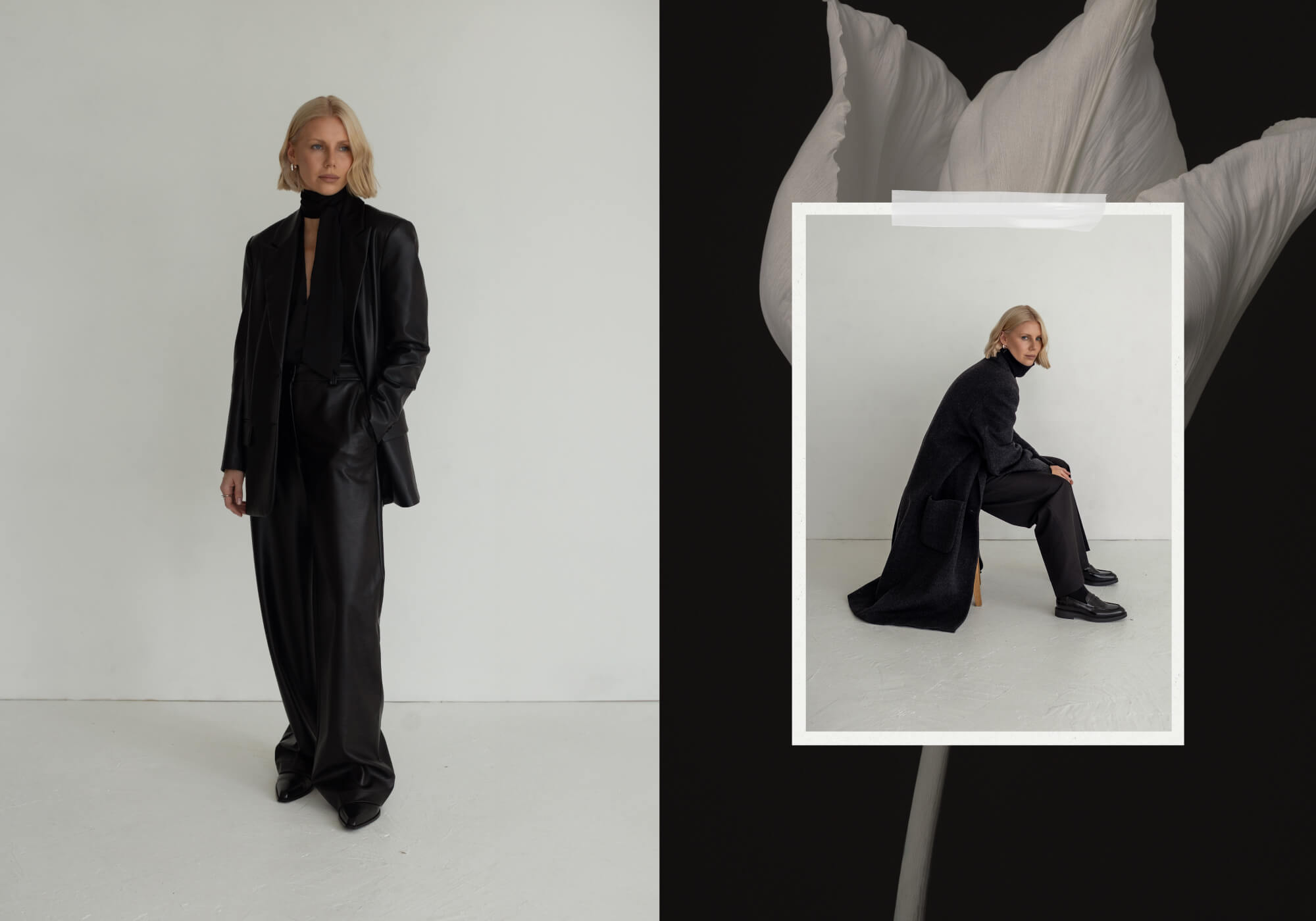
Minimalist Visual Direction
Defining the Visual DNA
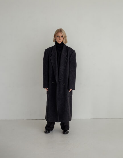
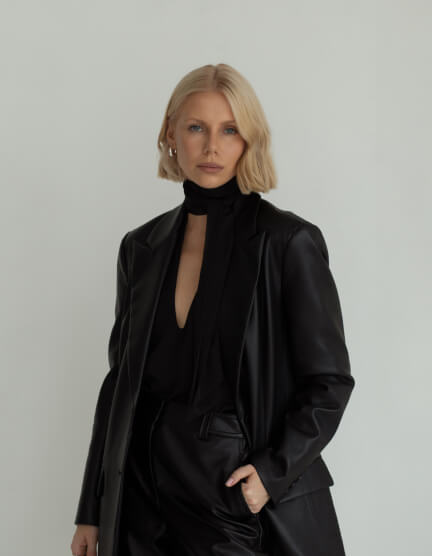
This visual direction establishes the core aesthetic of the brand through clean compositions, muted tones, and subtle Art Deco influences. The imagery captures a balance between strength and elegance, reflecting Violetta’s signature unisex styling approach while setting a refined and timeless foundation for the overall identity.
Finding Authenticity
Signature Mark
The logotype was designed to strengthen recognition by connecting the established name “Minimalistlooks” with Violetta Fainsil’s personal identity. Inspired by Art Deco aesthetics, the mark features a refined monogram combining the letters V and F, expressing a balance between femininity and masculinity. A minimalist approach guides the composition, with “Minimalistlooks” leading as the primary element and the signature line “by Violetta Fainsil” adding a personal and strategic layer to the brand.
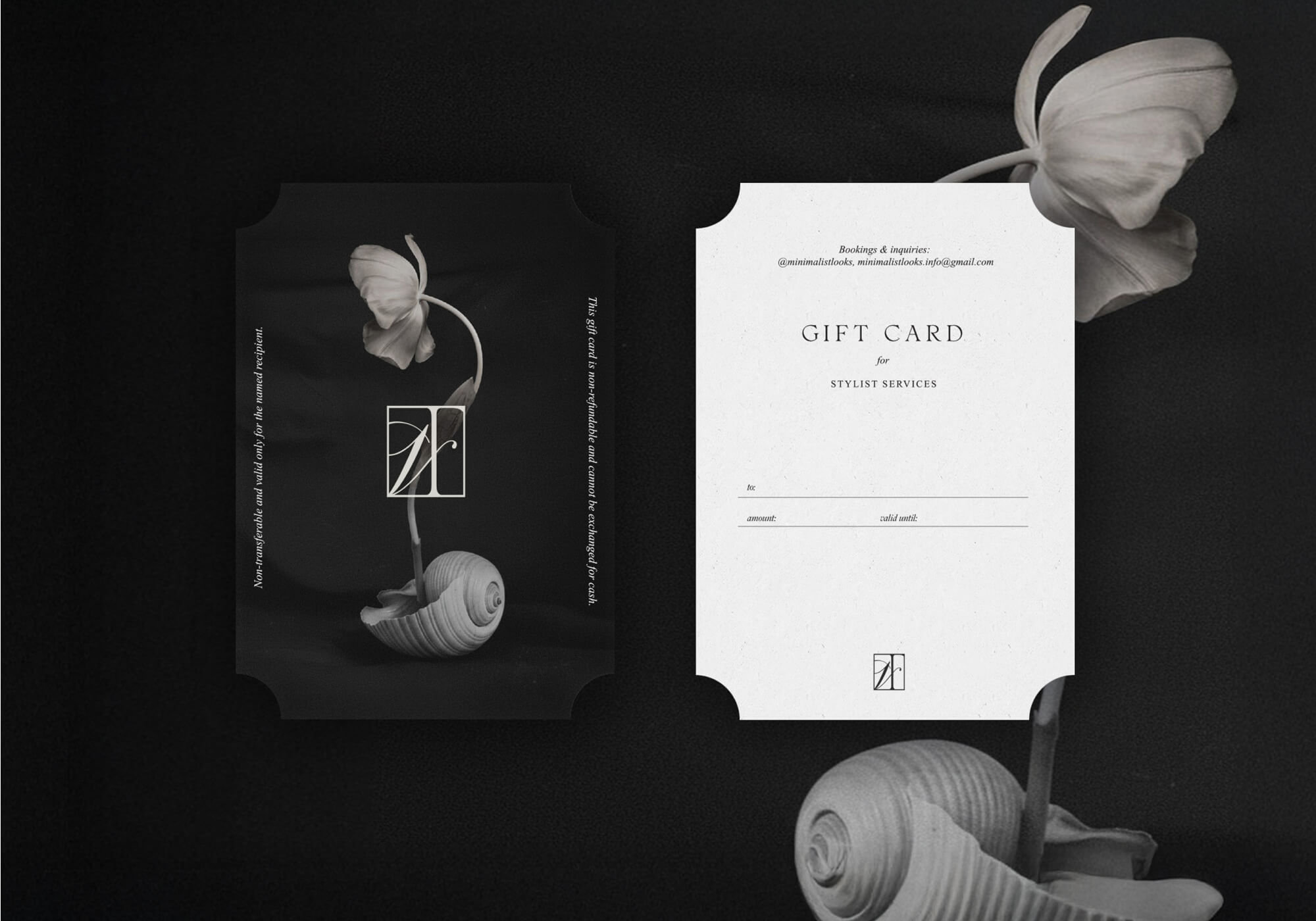
cut the edge
Elevating the Details
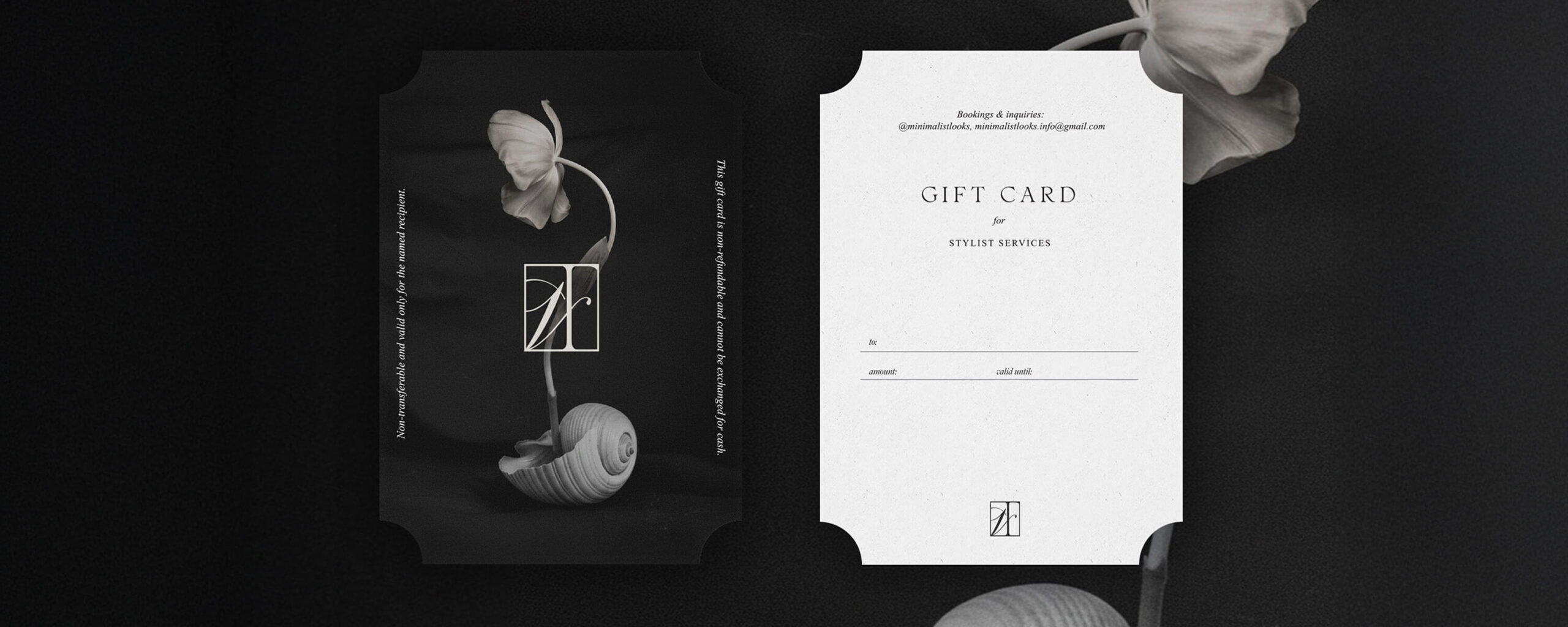
The gift card extends the brand’s minimalist direction while introducing a subtle sense of distinction. A curated visual on the cover is paired with vertically aligned typography and fine graphic lines, adding structure and a refined edge. The reverse side follows a more restrained layout, allowing content to remain clear and functional. Distinctive Art Deco inspired cut corners give the card a unique silhouette, reinforcing the brand’s identity through both form and detail.
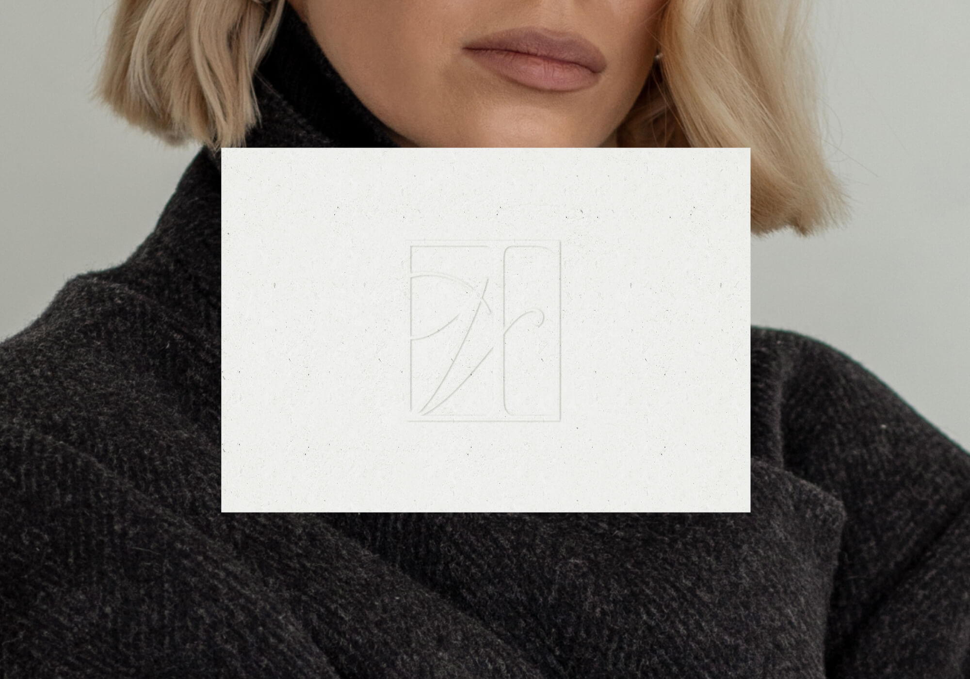
cotton note
Quiet Luxury
The note card was designed as a refined extension of the brand, allowing Violetta to leave a personal yet elevated impression. The approach is intentionally minimal, featuring no printed elements, only an embossed monogram that reveals itself through light and texture. Produced on premium cotton paper, the card enhances the tactile experience while reinforcing the quiet, sophisticated nature of the brand.
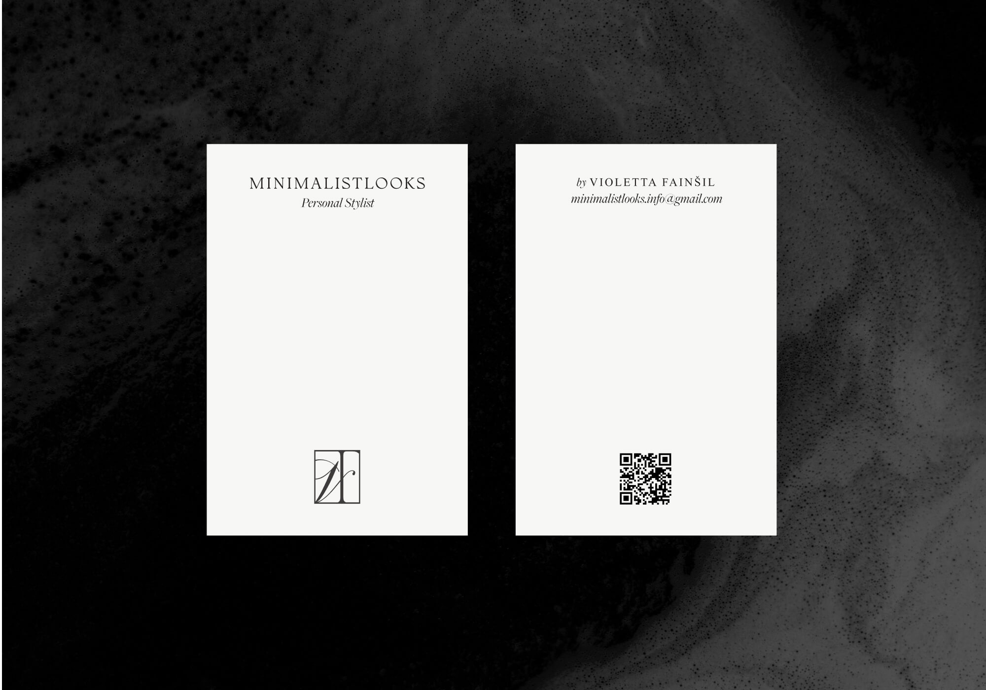
Business Card
Clarity as Identity
The business cards follow the same minimalist approach, designed on premium cotton paper with a strong focus on clarity and space. Only essential information is included, aligning with the client’s preference for digital communication over phone calls. A QR code is integrated as a functional element, directing users to Instagram, while the layout remains clean and refined, reinforcing the brand’s quiet and intentional identity.
Next Project