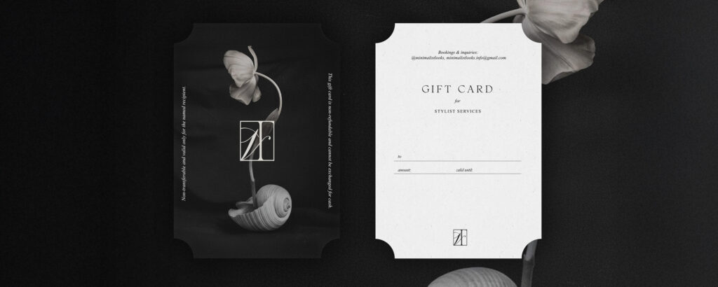
Project name
Aesthetic branding for stylist Minimalistlooks by Violetta Fainsil
Testimonial
„It’s always a pleasure to work with a professional — and that’s exactly what Agnė is: attentive to detail, undoubtedly possessing great taste and a strong sense of aesthetics.”
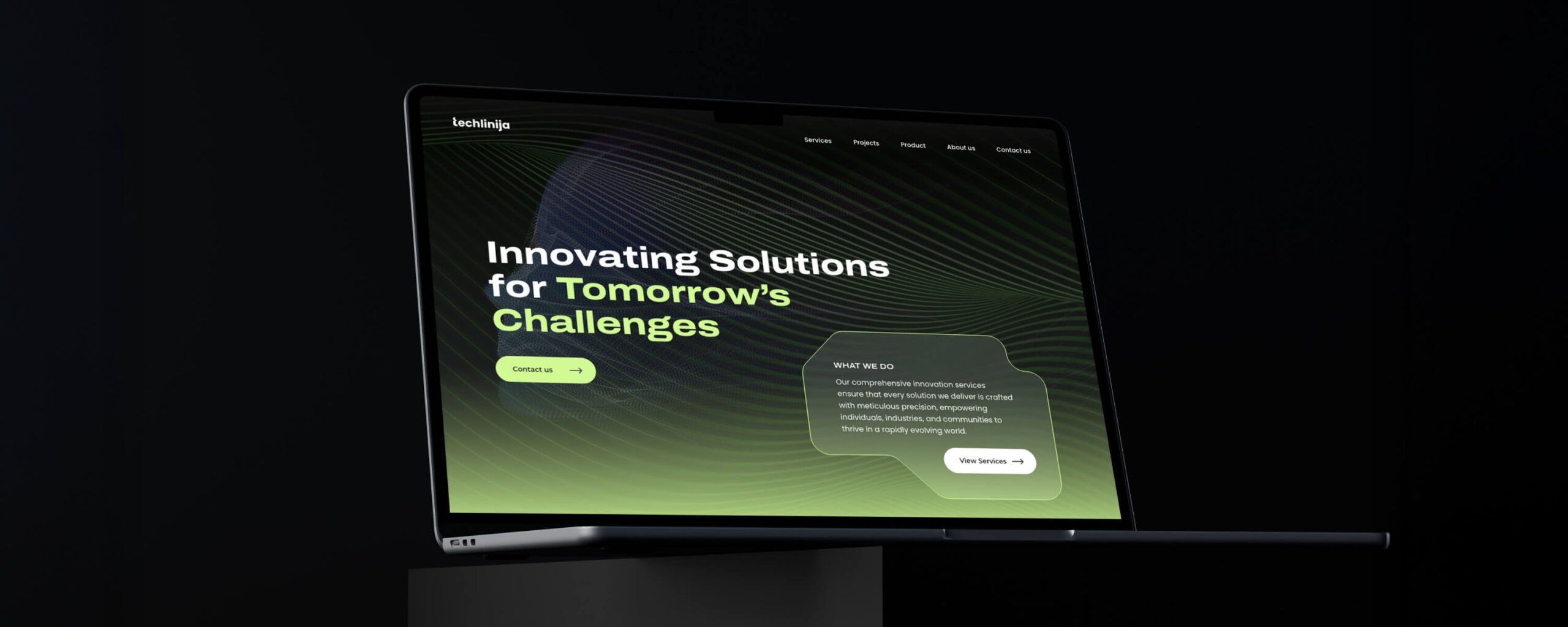
Techlinija is a Lithuanian technology company focused on innovative solutions for medical and environmental home sectors. The company operates across manufactured subsystems, software engineering, and development services. With a clear and confident vision, the brand is built around a modern, slightly mysterious, and technology-driven identity that reflects precision, innovation, and forward thinking.
The project covered the development of a complete brand identity system, starting with the logotype and extending into a cohesive visual language. This included business cards, a structured brand book, and a flexible design system built around line-based motifs and a distinctive visual direction. In addition, website design and landing pages were created, supported by UX and UI best practices, ensuring clarity, consistency, and strong communication across all touchpoints.
First Things First
Engineering the Identity
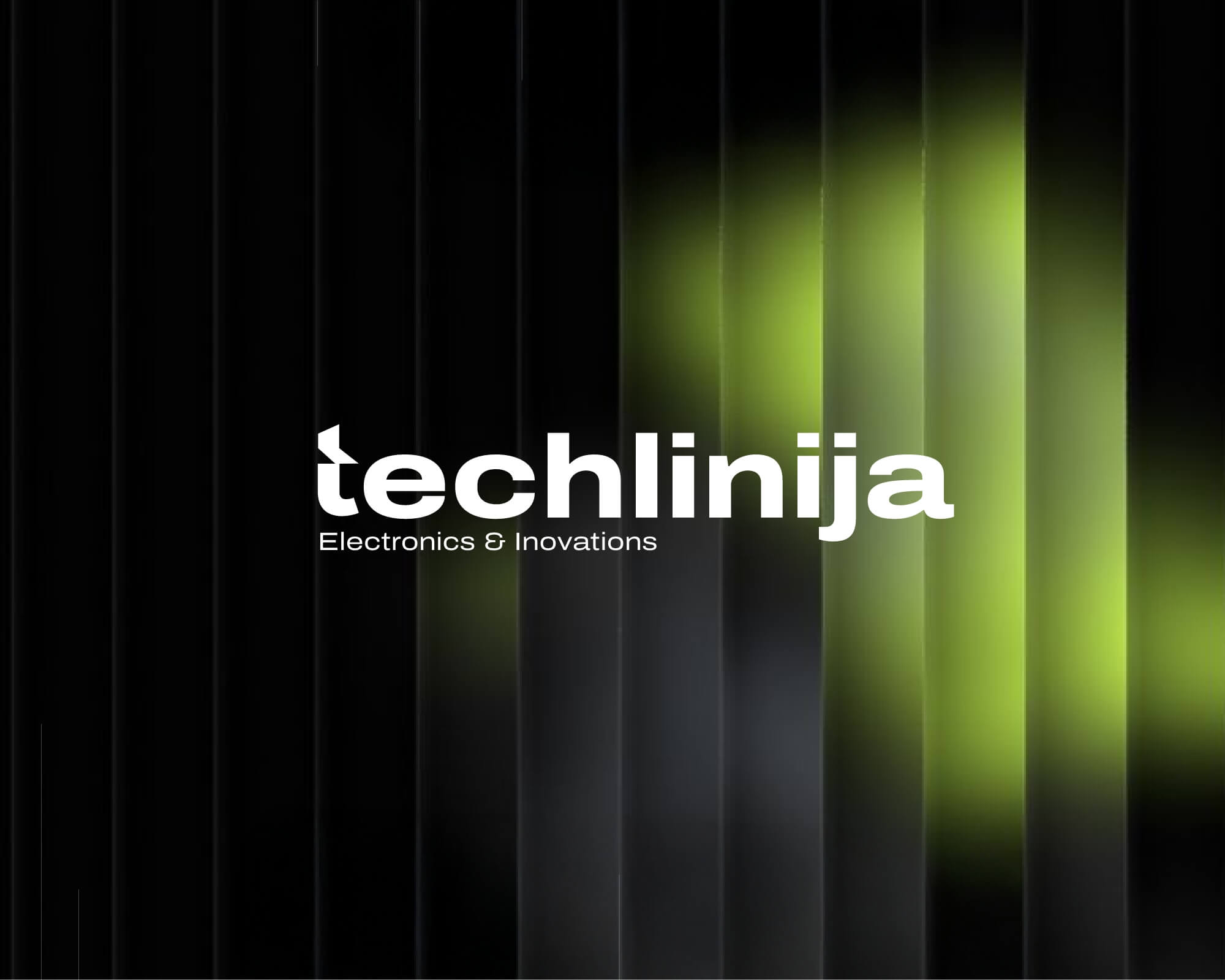
The project began with the creation of the logotype, shaped by a clear and confident client vision. The direction called for a modern, clean aesthetic with a subtle distinctive edge. A bold, wide typeface was chosen to convey stability and technological strength, forming a solid foundation for the brand.
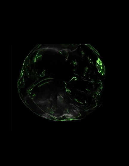
A refined detail within the letter “t” introduces a forward pointing gesture, adding movement and a sense of innovation. This small but intentional tweak brings character to the mark and later evolves into a standalone symbol, allowing the brand to exist beyond the full logotype when needed.
A refined detail within the letter “t” introduces a forward pointing gesture, adding movement and a sense of innovation. This small but intentional tweak brings character to the mark and later evolves into a standalone symbol, allowing the brand to exist beyond the full logotype when needed.
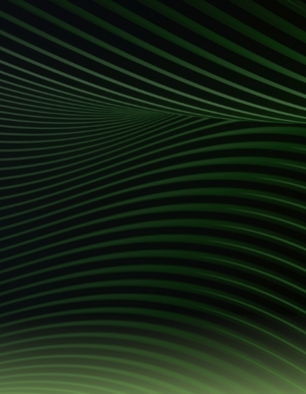
Lines All Over the Place
Precision in Motion
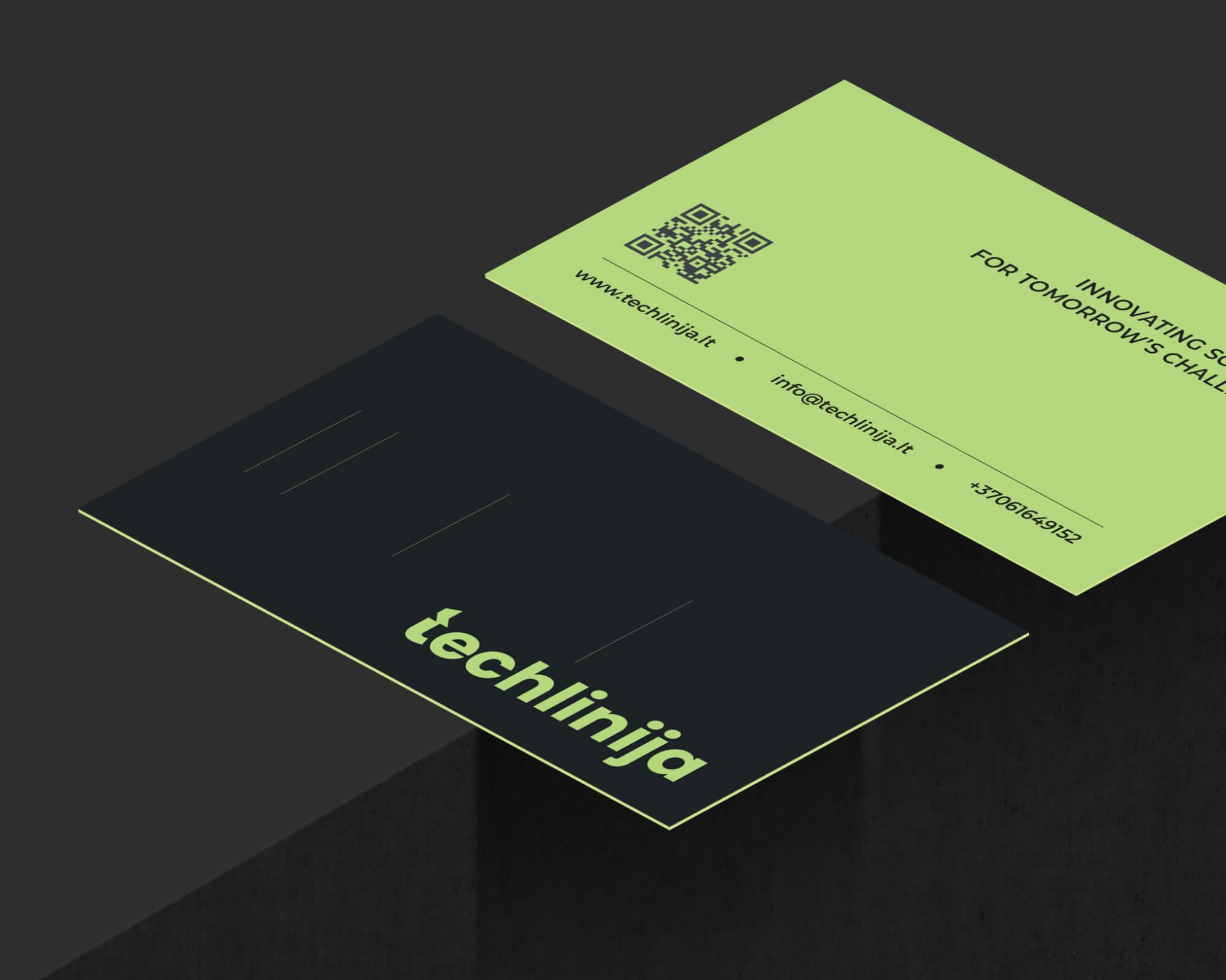
Line motifs became a defining element of the identity, inspired by precision technologies such as lasers and 3D printing. On the business cards, these lines introduce structure and rhythm while maintaining a clean and minimal composition. Beyond print, the same visual language extends across the brand, from abstract compositions to subtle technical references, creating a cohesive system that reflects innovation, movement, and engineering clarity.
Everything in One Place
Brandbook Design
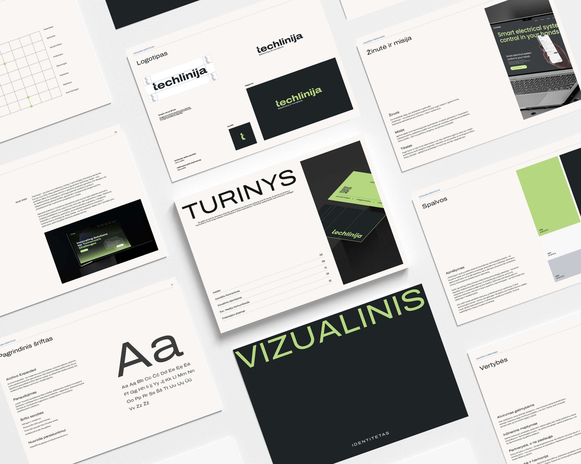
To ensure consistency and clarity across all touchpoints, a comprehensive brand book was created as a complete guide to the identity. It brings together every element of the brand, from visual language and typography to tone of voice and positioning. Each component is defined and applied in detail, providing a structured system that supports the brand’s growth while maintaining a cohesive and controlled expression.
Readablity experience
All about the readers
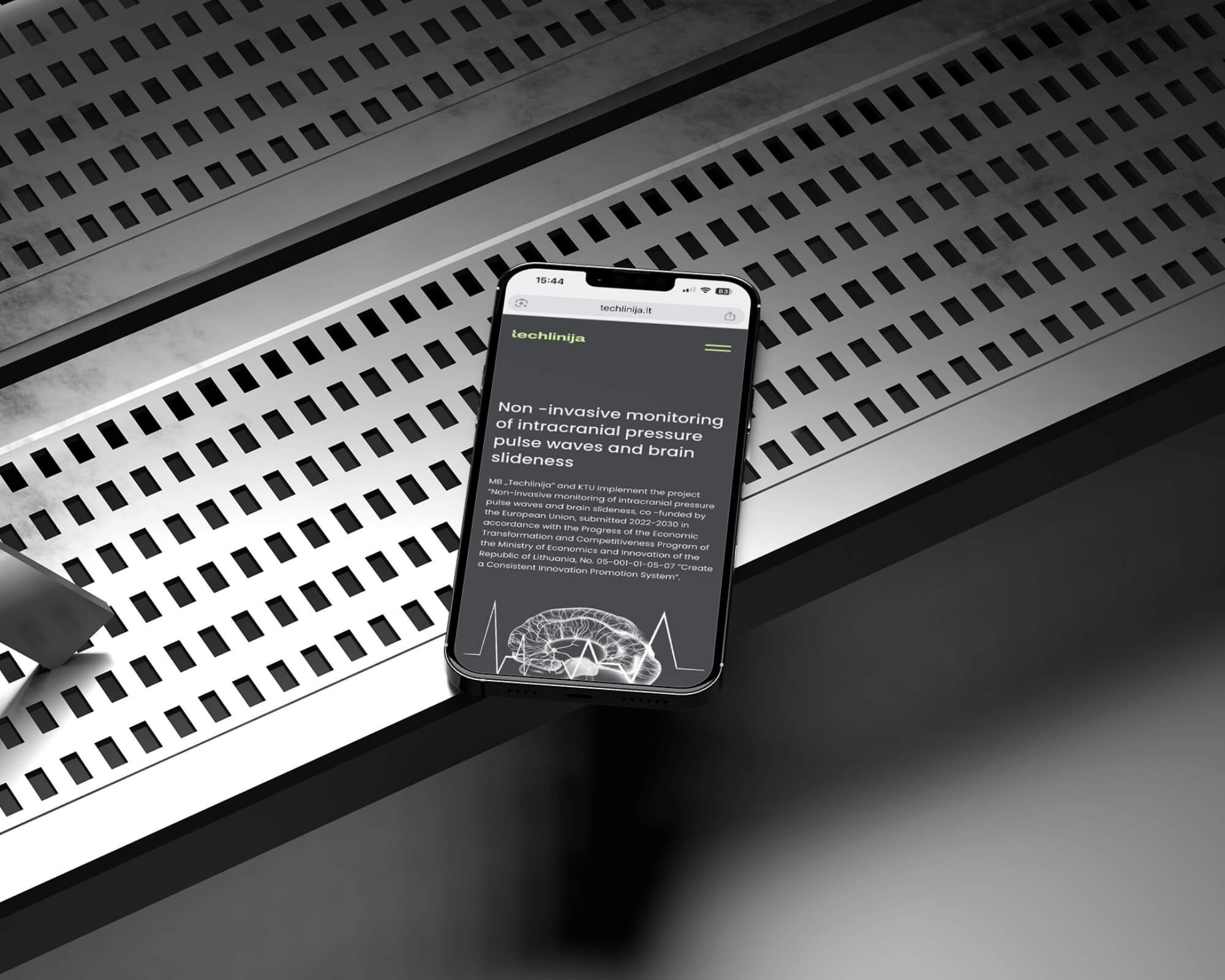
While the overall website follows a dark visual direction, a light mode was introduced for article pages to enhance readability and create a more comfortable, user-friendly reading experience.
Easy to CONNECT
Small Touches Big Impact
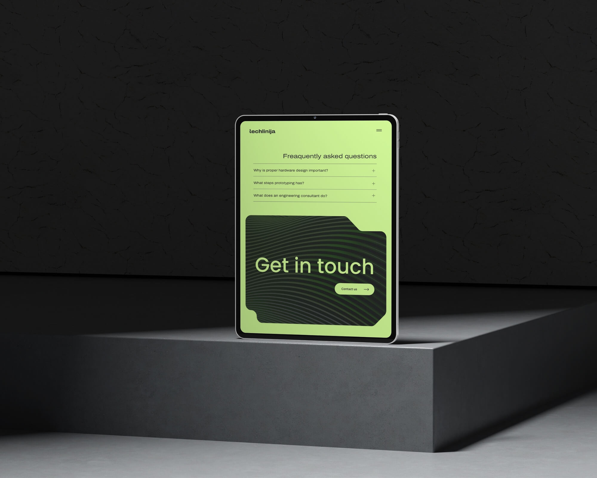
The primary goal was to make it easy for the client to connect with their target audience. I created a wide call-to-action section leading directly to the contact page. Its shape was inspired by development boards and microchips, and combined with linear elements. In contrast with the light green accent, it stands out as a clear invitation to engage.
landing page design
Modern and techbased
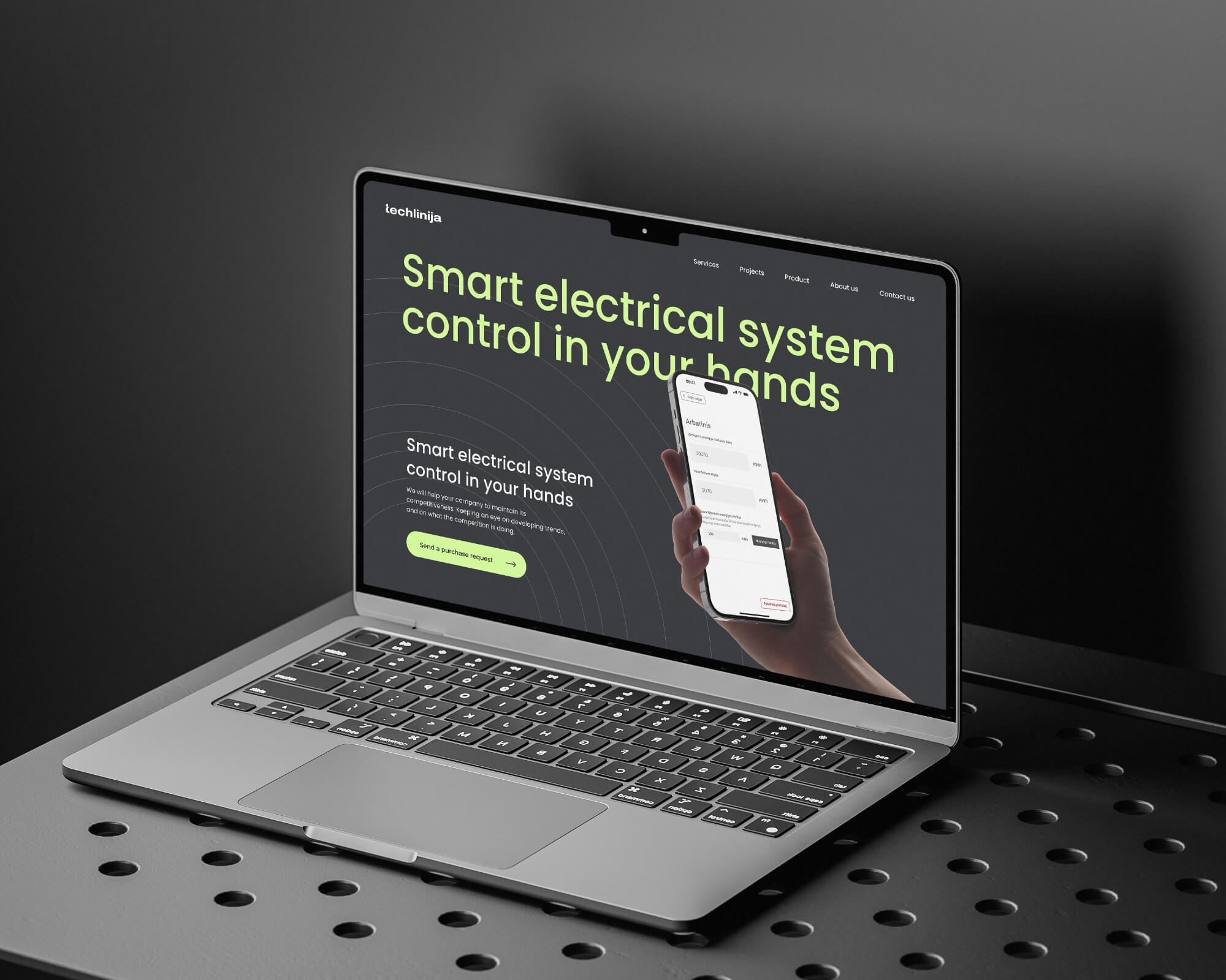
After the website was launched, the client returned with a request for a landing page for their new product. Having an established brand foundation made the process efficient and focused. Based on UX and UI best practices for landing pages, a clear structure was developed, including call to action sections, key benefits, value propositions, and pre-order functionality. This was supported by prototype mockups, ensuring strong visual presentation and optimized conversion potential.
Next Project