Project name
Website redesign for vehicle's history checker VinPatikra
Testimonial
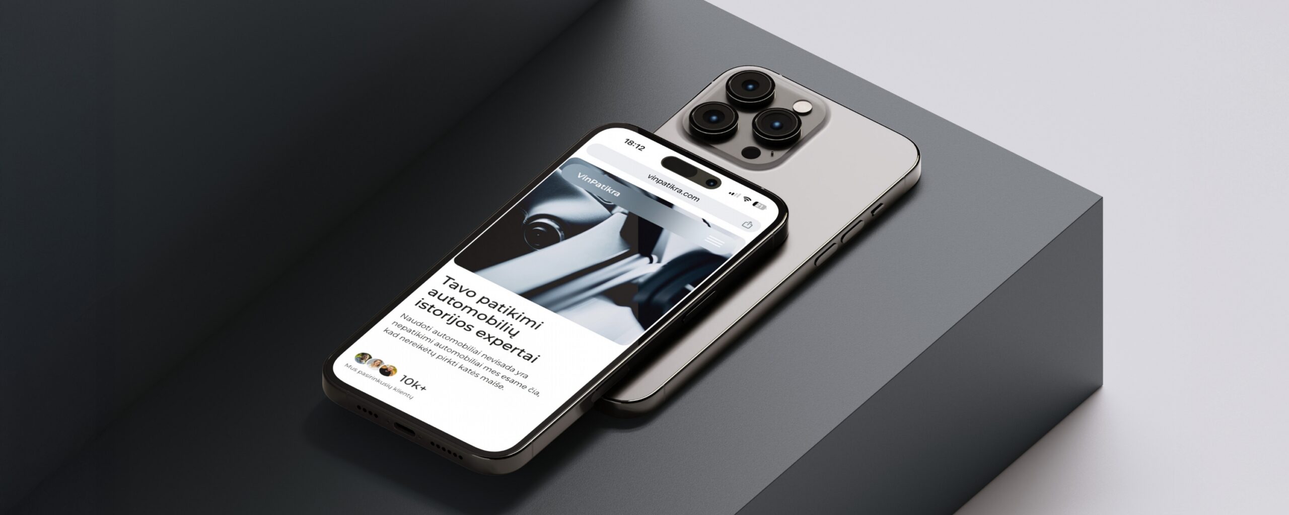
VinPatikra is a platform that helps users check a used vehicle’s history using its VIN number, making it easier to avoid cars with hidden issues. The client initially requested a rebrand, feeling the website no longer performed as expected but unable to identify the exact problems. During our discovery session, we uncovered the main pain points: low user trust, an unclear conversion journey, and a lack of essential information needed for confident decision-making.
After identifying these challenges, I conducted a competitor analysis to better understand the market and highlight opportunities for improvement. Based on these insights, I redesigned the user experience by building trust throughout every stage of the website, improving the content structure, and creating clear paths to conversion. The result is a more intuitive and credible platform that helps users make informed decisions while increasing confidence and conversion potential.


Emotional Strategy
Selling Point and
User Connection
User Connection
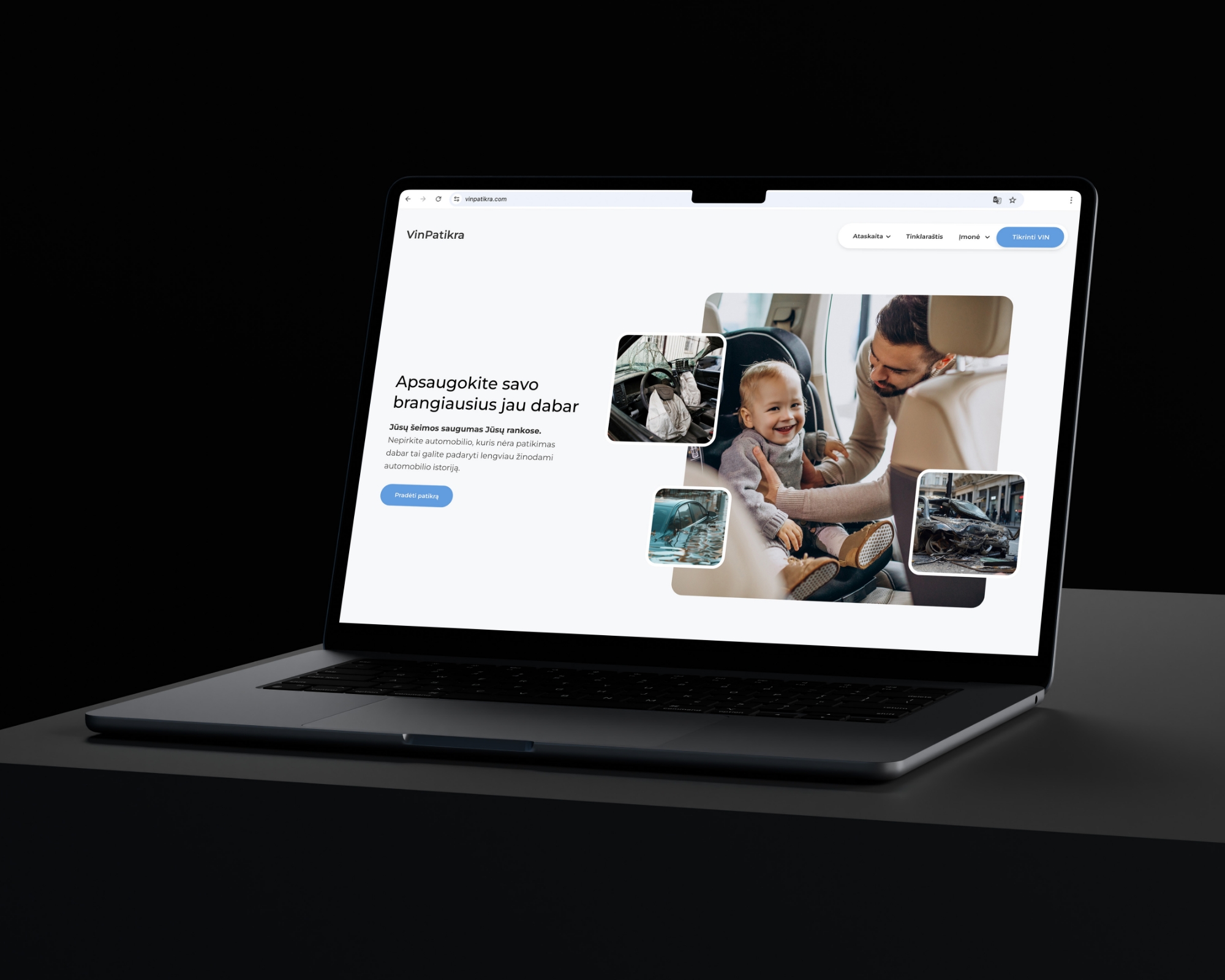
Taking the target audience into account, people buying used cars, I created an emotional and impactful call to action supported by strong visuals. The main message is simple and direct: Protect your loved ones.
This single CTA speaks to users emotions, not just their logic. Visually, it shows a happy family contrasted with subtle scenes of risk such as accidents, water damage, and breakdowns. The goal is to create just enough tension to make users stop and think, Is this car really safe? That emotional pull leads them to take action. With Vin Patikra, all it takes is entering the VIN to uncover the car’s full history before making a decision.
This single CTA speaks to users emotions, not just their logic. Visually, it shows a happy family contrasted with subtle scenes of risk such as accidents, water damage, and breakdowns. The goal is to create just enough tension to make users stop and think, Is this car really safe? That emotional pull leads them to take action. With Vin Patikra, all it takes is entering the VIN to uncover the car’s full history before making a decision.
Reducing Uncertainty
Make users aware
of every step
of every step
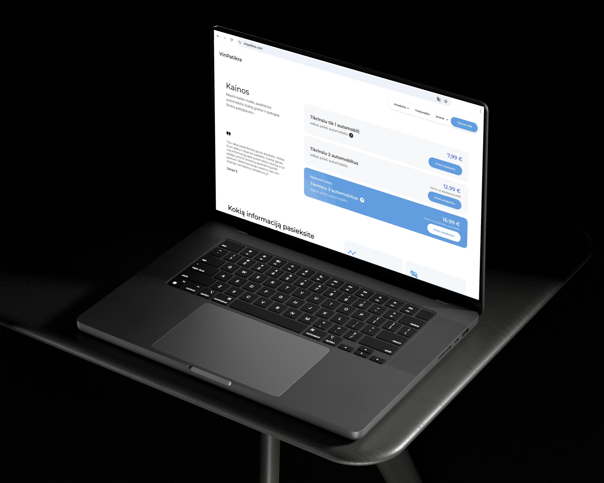
To make the most of the pricing page, I used price differentiation to guide users toward the most valuable plan by making the best offer visually stand out. A trust building pull quote added credibility, while the most common “What’s next?” questions were answered right away using a question mark icon for easy navigation.
I also included details about what users actually receive after purchasing the service. Clear value, no confusion, and no need to ask more questions. The layout was built to help users make quick and confident decisions.
I also included details about what users actually receive after purchasing the service. Clear value, no confusion, and no need to ask more questions. The layout was built to help users make quick and confident decisions.
Information Architecture
Making complex information easy to navigate
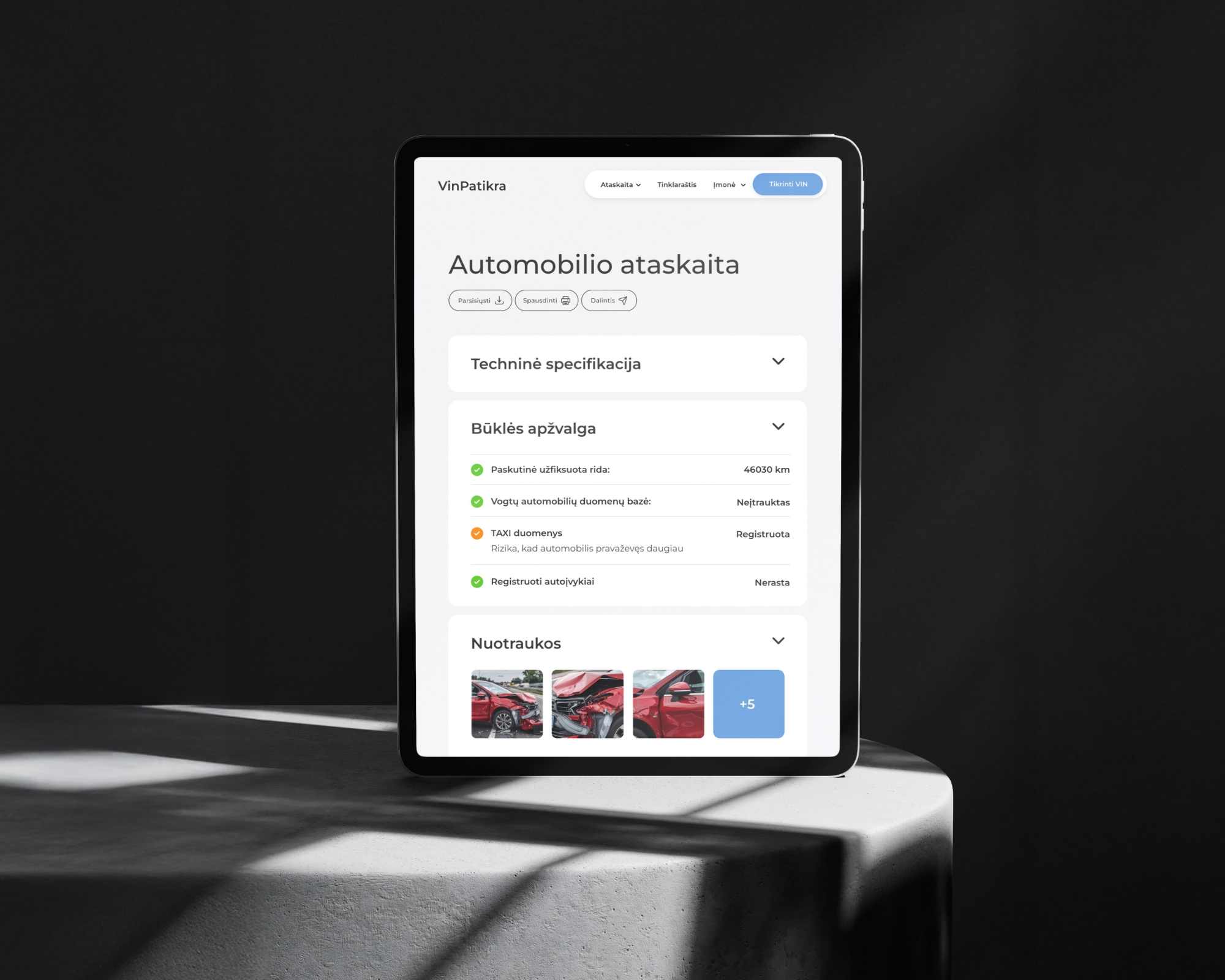
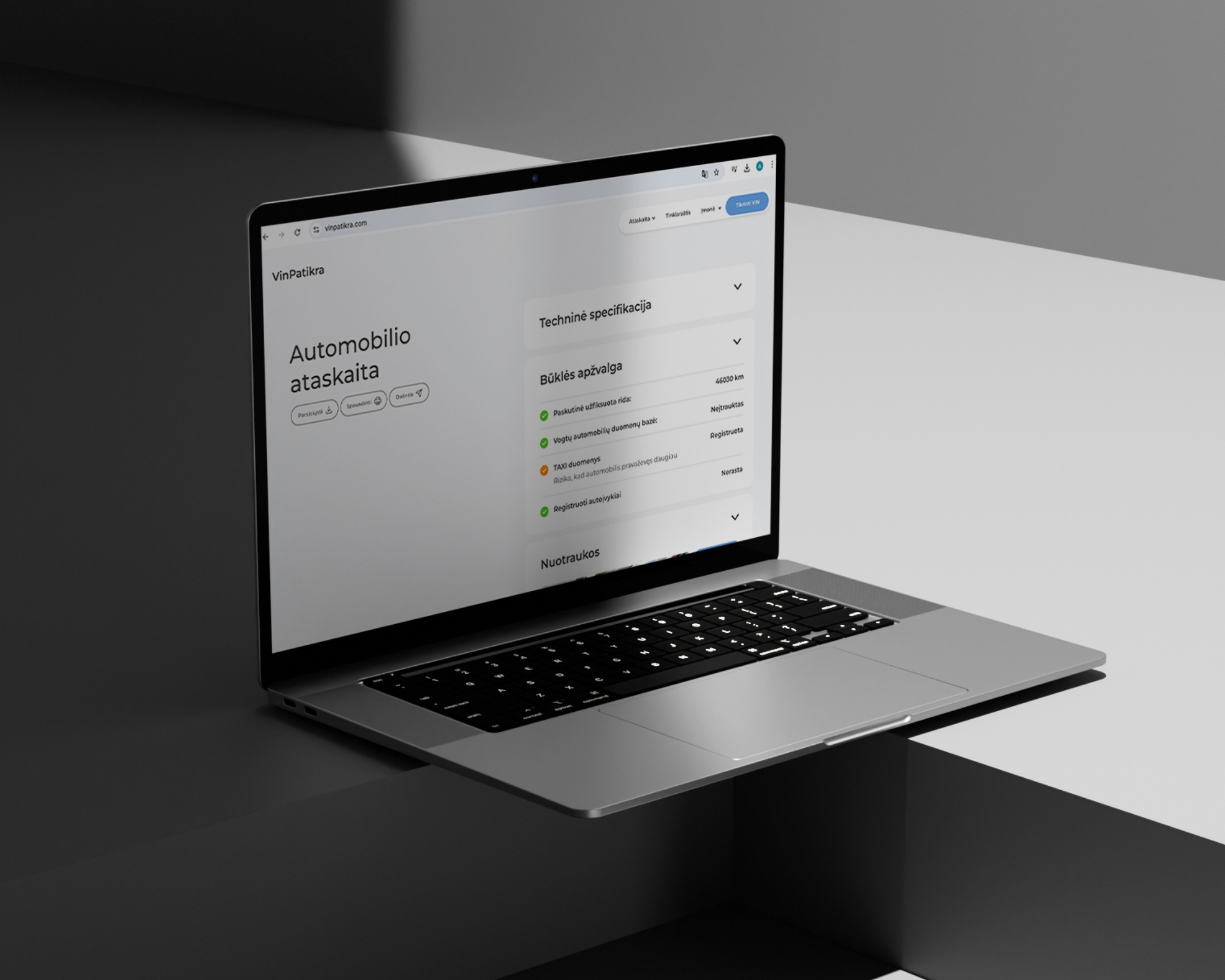
A key objective was to provide users with a structured and seamless car history report that is accessible on any device. Previously, the report was delivered as a simple PDF without a clear structure, which often led to confusion. To improve this, I organized the information into clear categories and sections using intuitive accordion panels, making the report easy to navigate.
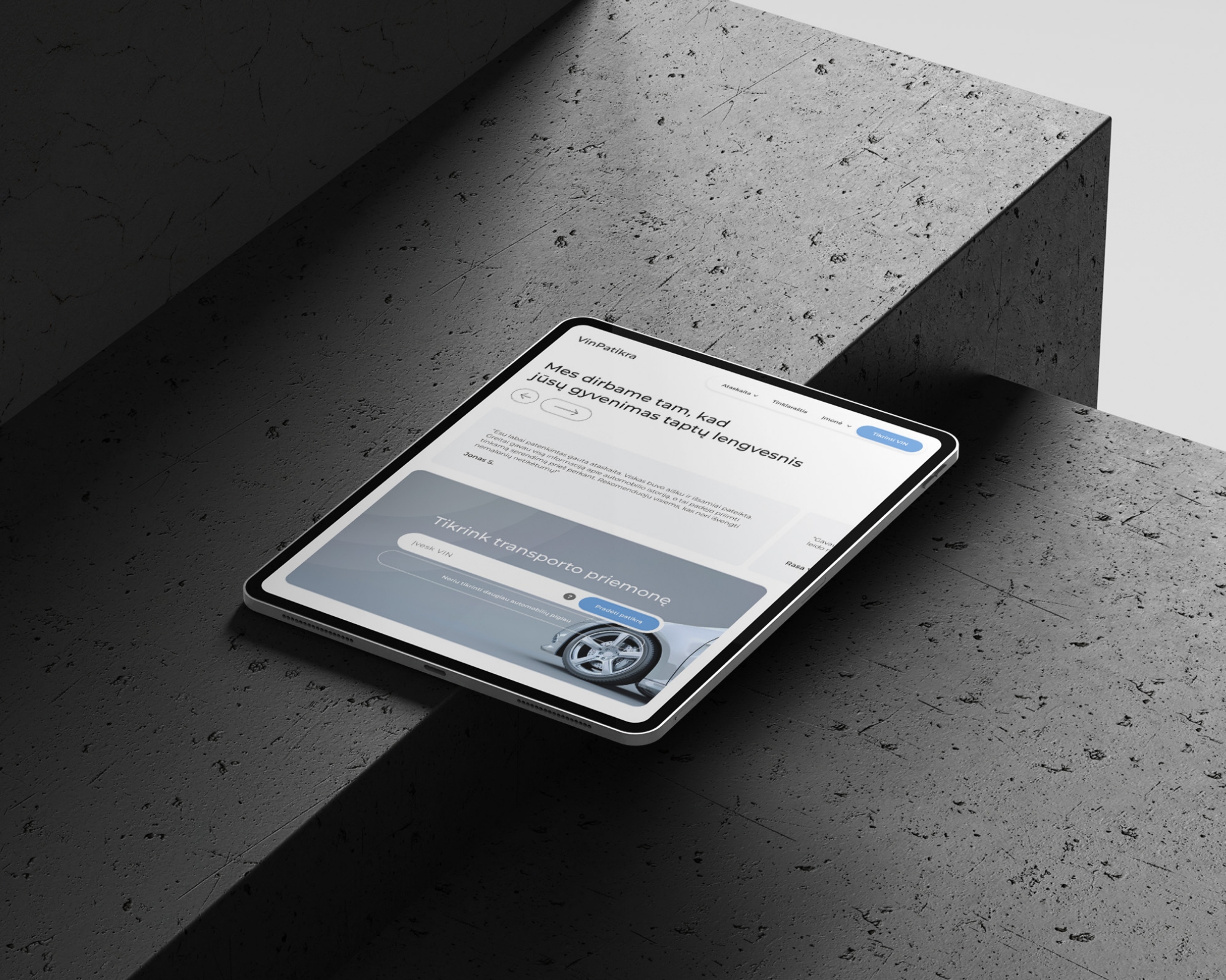
Knowing that many users would access the report on their mobile phones, I designed the experience to adapt seamlessly to smaller screens while keeping all information clear and easy to understand.
Knowing that many users would access the report on their mobile phones, I designed the experience to adapt seamlessly to smaller screens while keeping all information clear and easy to understand.
Visual Hierarchy
Clear alerts and responsive experience
The design also included a color coded alert system, allowing critical information to stand out immediately. I ensured the report was fully functional, giving users the ability to print, share, and download it effortlessly. The experience was optimized for desktop, mobile, and tablet devices, providing clear navigation and usability across all screen sizes.
Trust Building
What you see is what you get
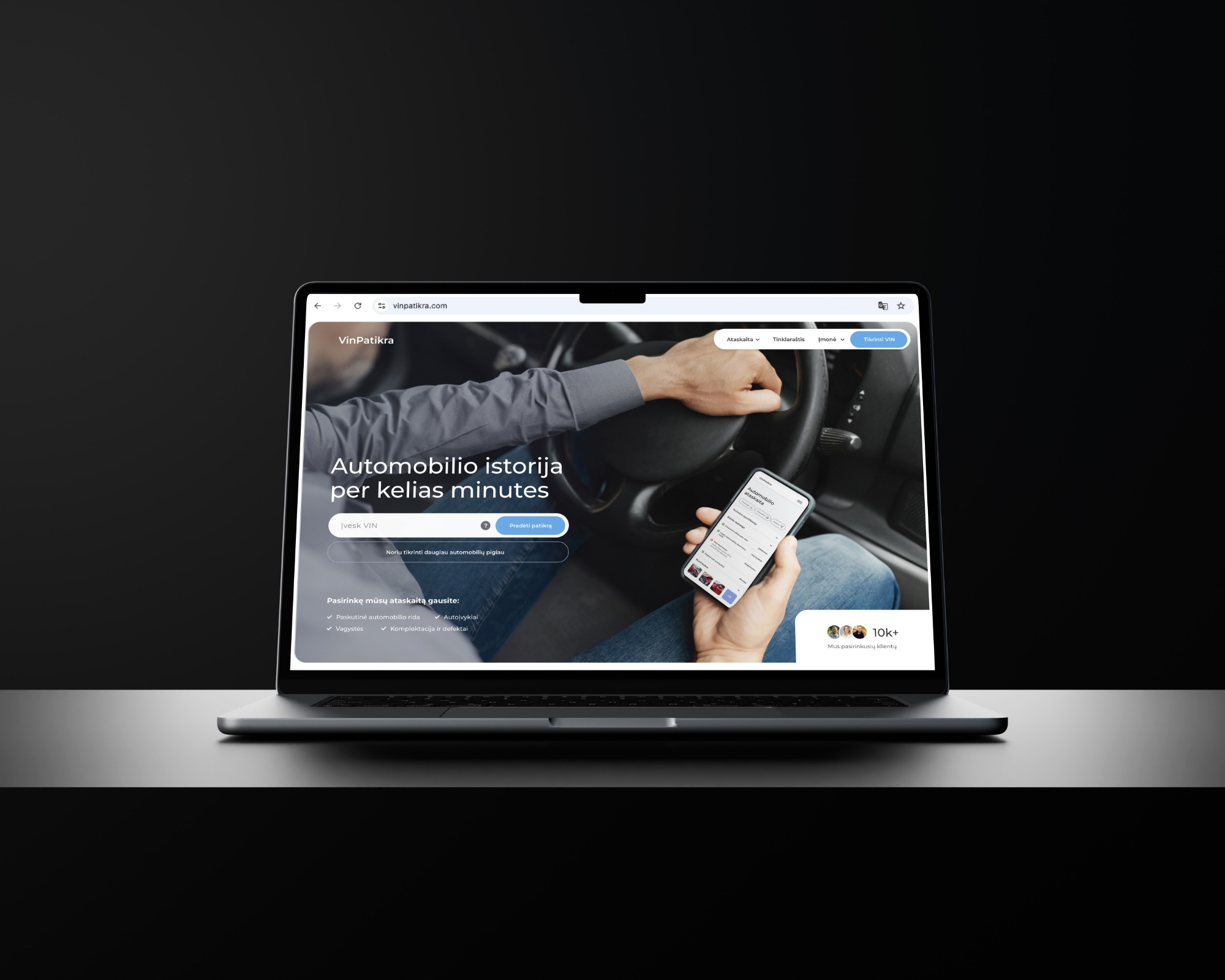
Transparency is key when it comes to building user confidence. To establish credibility right away, I placed a mockup of the final report directly in the hero section, so users could see exactly what they would receive. This immediate clarity helped set expectations and reduce hesitation.
Social Proof
Building trust with real data
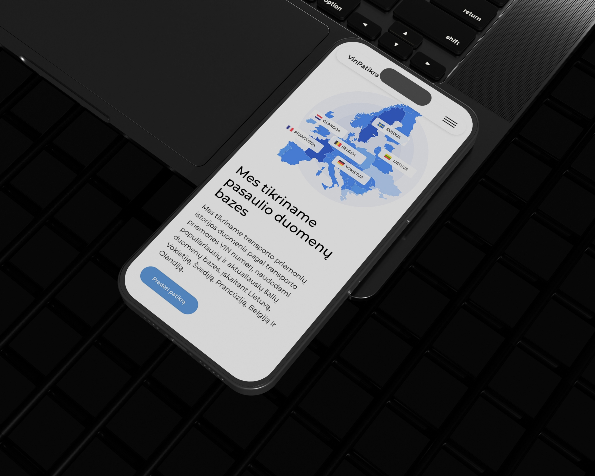
To strengthen trust even further, I added real testimonials and usage statistics as social proof. I also included a map highlighting the countries where the vehicle data is sourced. This gave users a better understanding of the report’s coverage and reliability, reinforcing the value of what they are paying for.
Brand Identity
Creating a recognizable visual language
The user journey was designed to feel simple from the very beginning. Just enter the VIN and make a purchase. Behind that simplicity is a thoughtful visual and emotional strategy. Throughout the website, I used a ripple effect as a subtle symbol of connection and the reach of reliable information. Combined with a blue color palette, the design communicates trust, clarity, and confidence.
Next Project